BITTER / SEMIBOLD 600
Aa
Iron & Oak
Architectural slab serifs. A grounded wordmark with a distinctive ampersand.
Bitter on Google Fonts ↗A considered identity.
A consistent impression.
The visual language, materials and practical standards behind Iron & Oak—collected in one place for every person shaping the brand.
Explore the identity ↓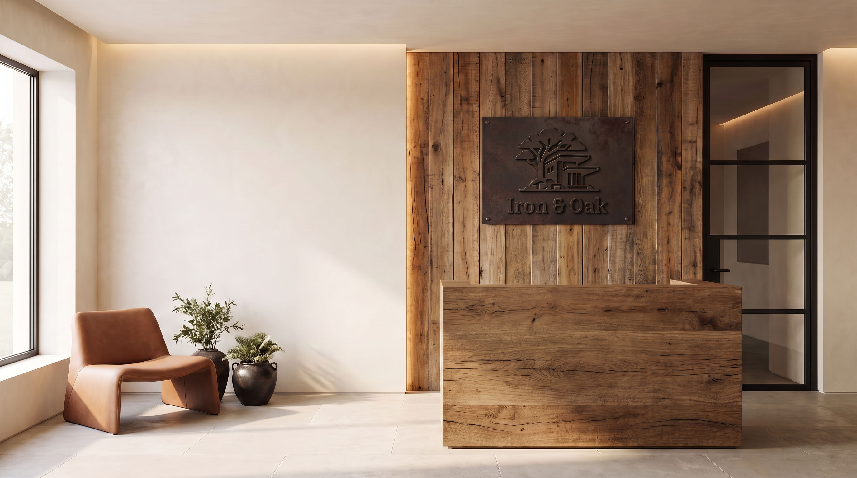
Iron & Oak is a builder and developer brand, with Hortter Street as its featured project. The identity brings together the solidity of iron and the natural character of oak.
The tree-and-house emblem connects architecture with its setting. Bitter gives the name a grounded, architectural presence. Manrope brings clarity to the information around it.
Name, Bitter lettering, supplied emblem and the approved five-sign family.
Generated office views and founder editorials express the design direction; they are not documentary office photography.
Digital palette, copy guidance and practical usage standards developed for this edition.
The original tree-and-house silhouette and Bitter wordmark form the core identity. Choose the composition that suits the space, while preserving the artwork.
 OUTLINED VECTOR ARTWORK
Leave at least half the height of the capital I around the artwork. Give it more room on busy or textured surfaces.
| Composition | Suggested width | Use |
|---|---|---|
| Horizontal / stacked combined | 220 px | Primary brand identification |
| Wordmark | 140 px | Compact header, footer or film credit |
| Original symbol | 96 px | Avatars, watermarks and larger graphic accents |
| I&O monogram | 64 px | Supplementary small graphic |
| IO micro monogram | 16 px | Browser favicon |
 Iron & Oak ×
The IO micro monogram protects legibility at browser size. The full emblem remains the primary symbol; the small initials are a supporting option.
Charcoal and ivory establish contrast. Oak, taupe and cognac add warmth. The physical material direction is established; these digital values translate it for consistent use.
Matte charcoal, quiet patina and visible depth. Legibility comes from relief, wood contrast and natural shadows.
Medium-tone wood with grain, knots and controlled natural variation. Substantial forms and honest joinery.
Warm ivory mineral surfaces, pale stone and restrained taupe or cognac seating. A calm background for the craft.
No gold, brass, bronze, copper, polished chrome or orange rust. Avoid glossy orange varnish, exaggerated distressing and decorative forge props. Warmth comes from wood, leather and light.
Use this pairing for reading text and controls. Check every other text/background combination against the WCAG contrast guidance ↗: at least 4.5:1 for normal text and 3:1 for large text.
Bitter SemiBold belongs to the logo. Manrope carries headings, body copy, navigation and interface labels. This pairing is reflected in the November 3 Framer implementation record.
Architectural slab serifs. A grounded wordmark with a distinctive ampersand.
Bitter on Google Fonts ↗Open, contemporary and readable. Weight 400 for reading; 500–600 for hierarchy.
Manrope on Google Fonts ↗| Role | Weight | Size in px | Line height | Tracking |
|---|---|---|---|---|
| H1 / primary | 500 | 80 / 68 / 48 | 1.08 | −0.03em |
| H1 / inner page | 500 | 52 / 44 / 36 | 1.20 | −0.02em |
| H2 | 500 | 48 / 38 / 28 | 1.20 | −0.02em |
| H3 | 500 / 600 | 34 / 28 / 22 | 1.20 | −0.015em |
| H4 | 500 / 600 | 28 / 24 / 22 | 1.30 | −0.01em |
| H5 | 500 / 600 | 22 / 20 / 18 | 1.30 | −0.01em |
| H6 | 500 / 600 | 18 / 16 / 16 | 1.40 | 0 |
| Body / large | 400 | 18 / 18 / 16 | 1.60 | 0 |
| Body / standard | 400 | 16 / 16 / 16 | 1.60 | 0 |
Breakpoint reference: desktop ≥1200 px; tablet ≥810 px; mobile <810 px. Font sizes describe the recorded website styles, not a requirement to fit every asset into the same scale. Original gallery page chrome uses its own utility fonts and is not the brand type system.
All recorded text-style variants, including the template’s different mobile sizes for regular, medium and semibold H2 styles. Values are preserved from the November 3 implementation record.
| Style | Weight | Desktop / tablet / mobile | Line height | Tracking |
|---|
Let the work carry the confidence. Describe decisions, materials and lived experience in clear language. Use warmth without slipping into vague luxury claims.
Name the place, the material or the design decision. Give the reader something they can picture.
Use short, natural sentences and active verbs. Explain the thinking without selling every detail.
Keep project status, approvals and specifications precise. Separate design intent from completed work.
“Unrivalled luxury. The ultimate in sophisticated living.”
“Warm oak, quiet light and carefully considered details.”
“Your dream home is ready.”
“Explore the design direction for Hortter Street.”
Use “Iron & Oak” consistently in headings, captions and credits. Keep sign copy to the name alone. Do not turn draft website copy into an official tagline.
Project descriptions should match verified documents. Office concepts communicate the brand atmosphere; they do not establish finishes, availability or approvals for a residential project.
Five applications, each with a distinct role. The emblem, name and restrained finish remain consistent as the scale and mounting change.
Use the supplied vector master for production, not traced generated lettering. Confirm dimensions, fixing methods and finish with the fabricator. The desk sign’s enclosed cutouts need a backing or bridges. These images communicate design intent.
Reception and consultation references establish the materials and light. The office series extends that direction into related spaces, with each sign placed where it serves a purpose.
Use eye-level views, straight verticals and believable room proportions. Keep furniture arrangements practical and leave room for circulation. Let the architecture be the subject.
Soft daylight and discreet concealed warmth. Preserve neutral materials and real shadows; avoid a sepia cast or a glossy showroom effect.
Identify generated images as concepts where the context could imply a built space. Do not use office concepts to promise Hortter Street finishes.
Use the approved room references for the environment and the vector logo or approved sign study for identity. The image model should preserve the sign, not redesign it.
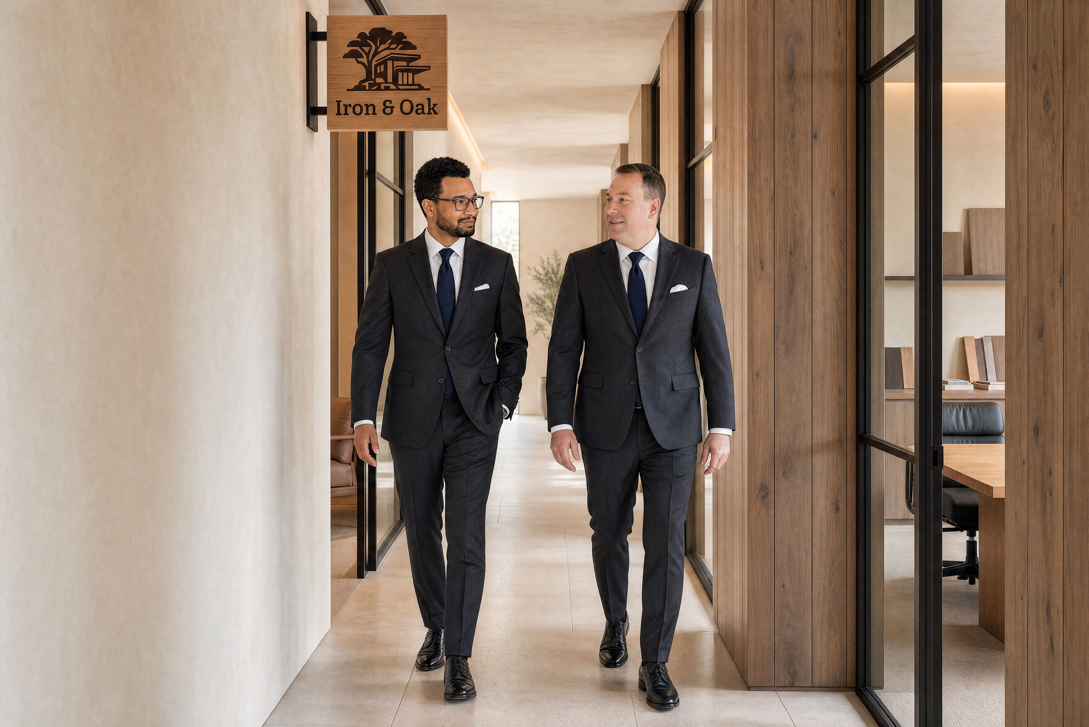
A coordinated series for Dax Richardson and Gerald Hevey, built from their individual likeness references and the approved office design direction. Portraits introduce each founder; wider editorials show the partnership.
Environmental portraits · 4:5 format
Four full-body options · landscape and portrait formats
Preserve each founder’s natural features, age and build. Use separate likeness references; never blend identities. Charcoal suits, white shirts, navy ties and white pocket squares connect the series.
Center individual portraits with comfortable headroom. Editorials retain complete figures, shoes and floor margin. Keep signs and faces clear when adapting a crop for a page or cover.
Use the approved oak, ivory and dark-iron references with natural light. Visible signs retain the complete Bitter “Iron & Oak” name and supplied emblem. No gold finish, tagline or legal suffix.
These are generated portraits and staged editorial options, not documentary photographs of a completed office. The files shown here are the current finished selection; earlier emblem-only portraits and superseded crops are excluded.
Keep the website focused on Iron & Oak as a developer, with the current project taking the lead. Reuse the existing Novalux structure and give the brand room within it.
Projects About FoundersUse project-specific imagery and verified information.
Explore the project ↗ Iron & Oak
The original identity, signage and office galleries are preserved alongside the current founder portraits and editorial series. Choose the individual files or the package that fits the job.
Black and white lockups, wordmarks, symbols, monograms, favicons, social assets and font source.
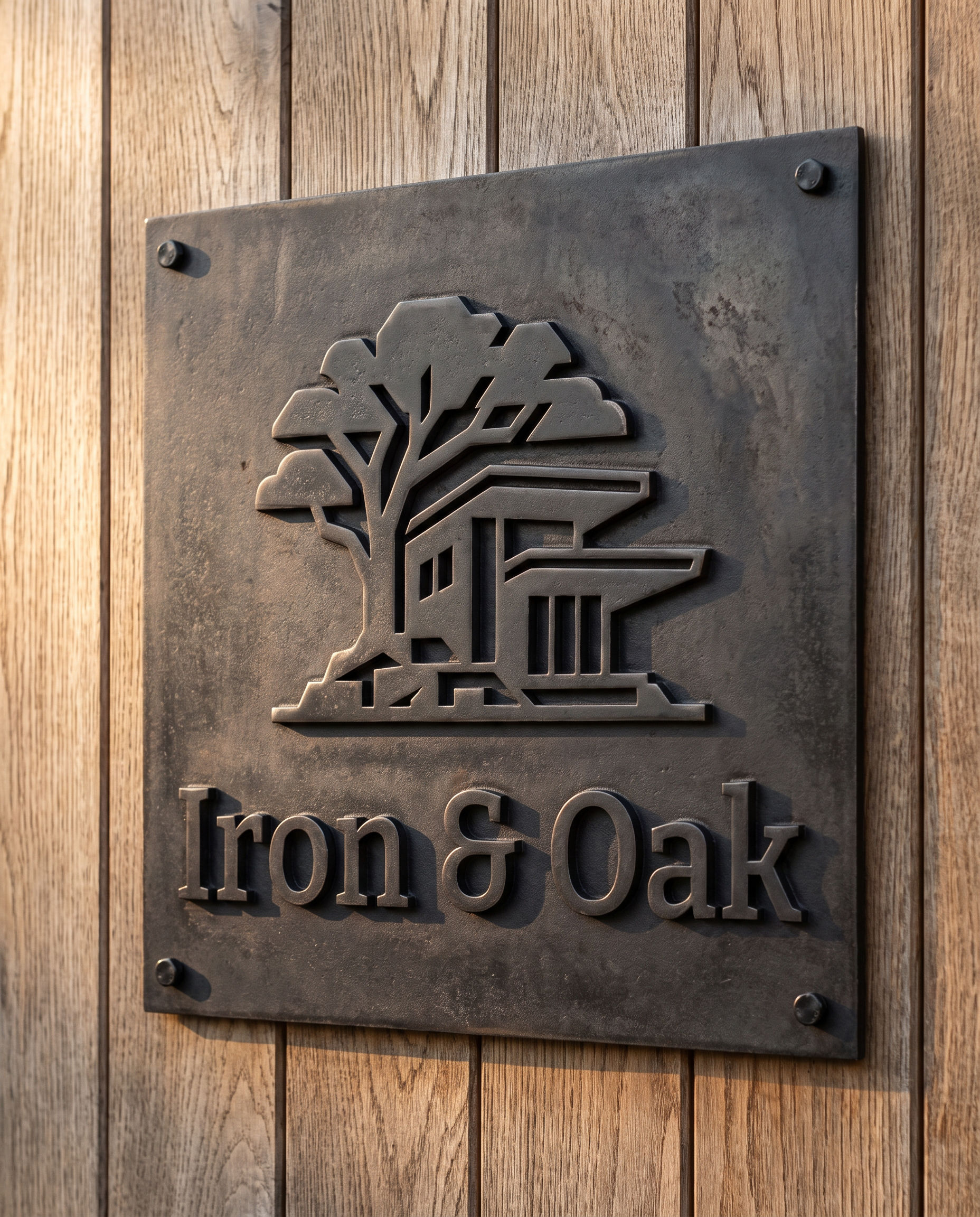
Approved plaque, raised wall logo, glass-door mark, projecting sign and desk sign concepts.
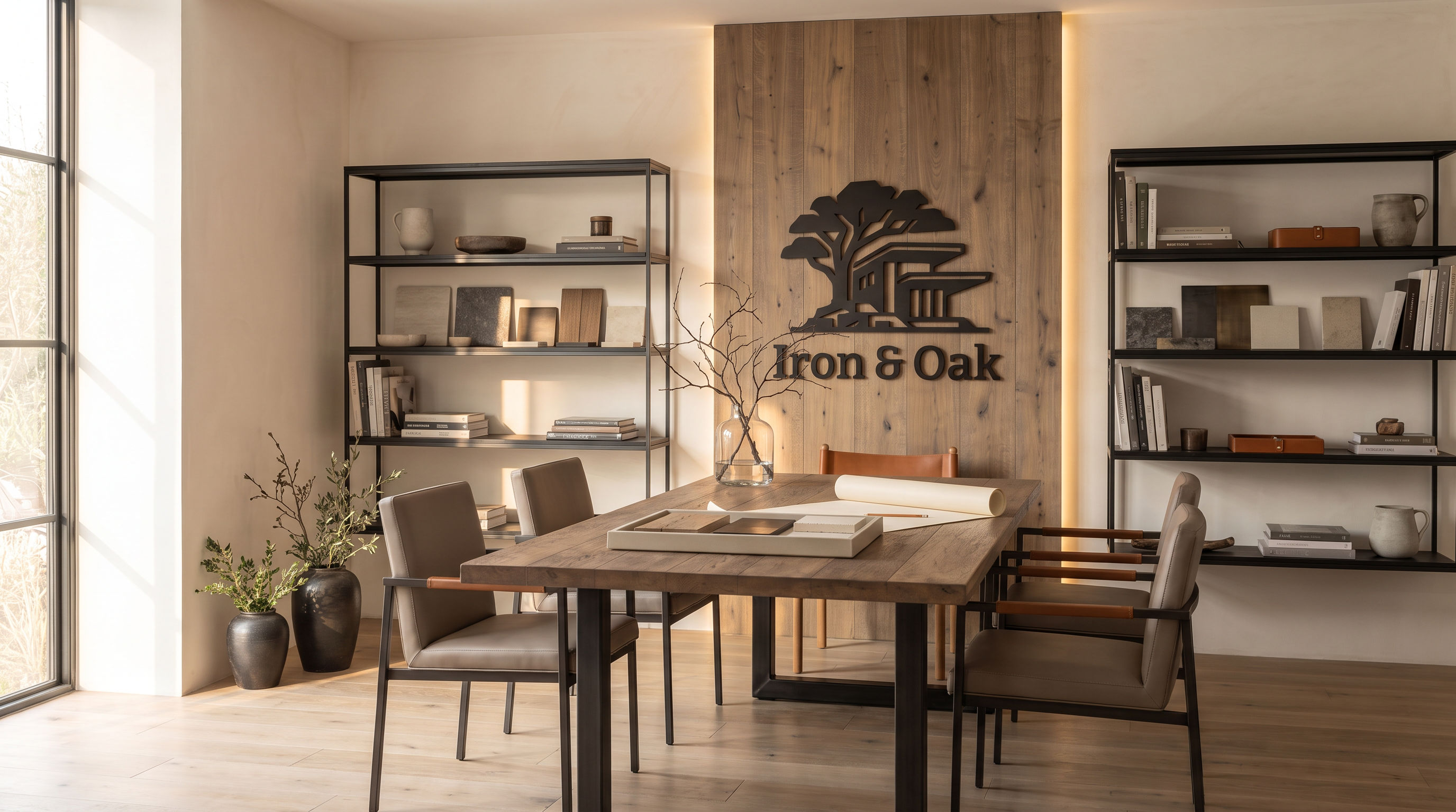
Five corrected room concepts with the sign family integrated throughout the office.


Two coordinated portraits: Dax Richardson and Gerald Hevey, with complete Iron & Oak signage.
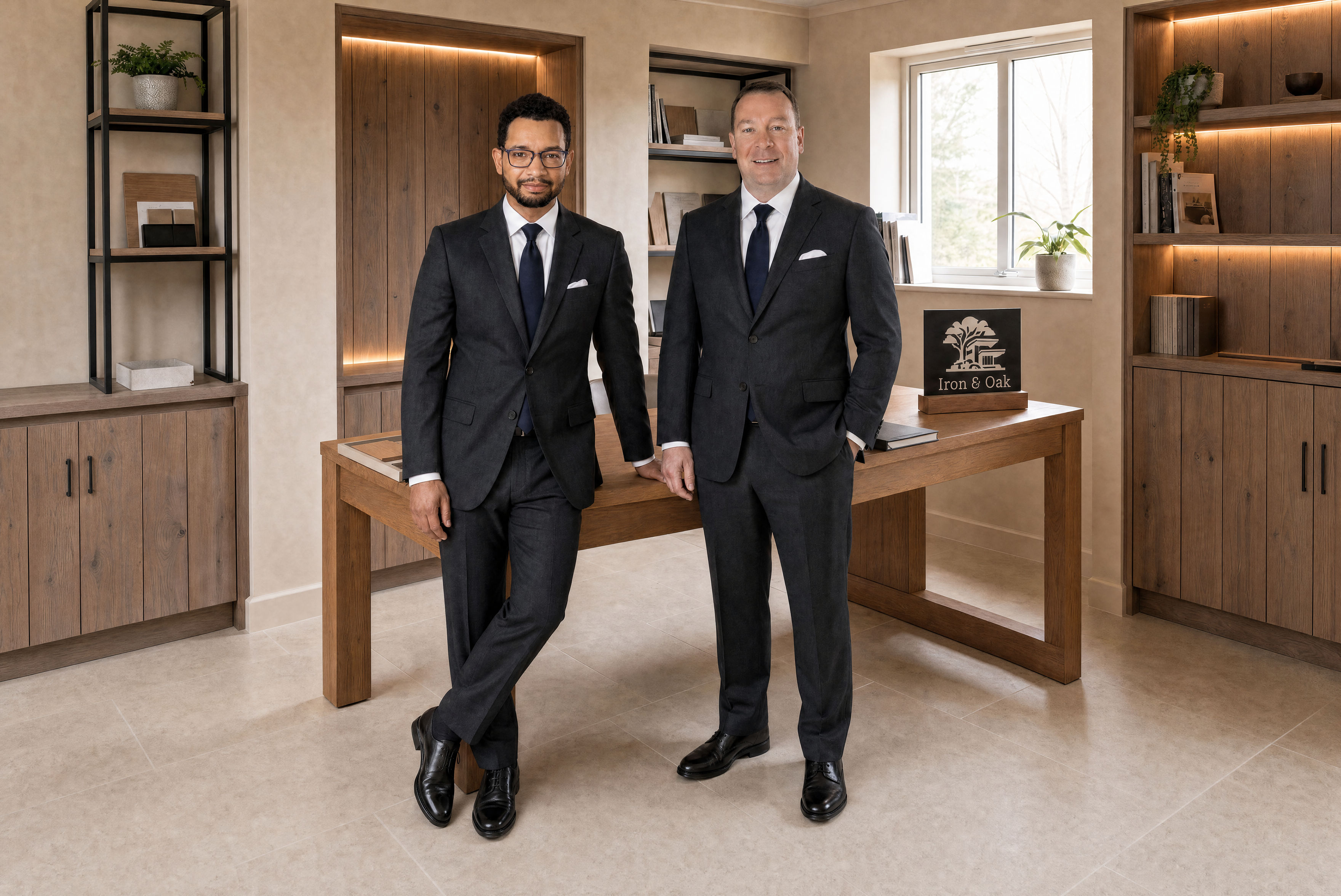
Four full-body editorial options. The standalone gallery also includes Dax’s individual portrait.
The six current images together: two individual portraits and four paired editorials, with a file guide.
SVG — scalable digital artwork; preferred for Framer.
PNG — transparent raster logo assets.
PDF — RGB vector artwork for layout and print handoff.
JPG — signage, office concepts and generated founder imagery.
Edition 02 adds the current individual founder portraits and four office editorials to the approved identity assets, five-sign studies, office-image series and recorded website typography. Practical usage, voice and digital colour guidance remain studio recommendations. Generated founder imagery is presented as editorial options; final signage production should always use the vector masters.